Jessica Svendson


Jessica Svendsen is an amazing designer working in identity, editorial design, & illustration. She has previously worked at Pentagram, New York for the great Michael Bierut and for Apple’s Global Communications team.

Currently, Jessica teaches design as adjunct faculty at Parsons, The New School &  at the Pratt Institute. She has served as a guest critic at the California College of the Arts & the School of Visual Arts. Lecture series have included the AIGA & the Type Directors Club.

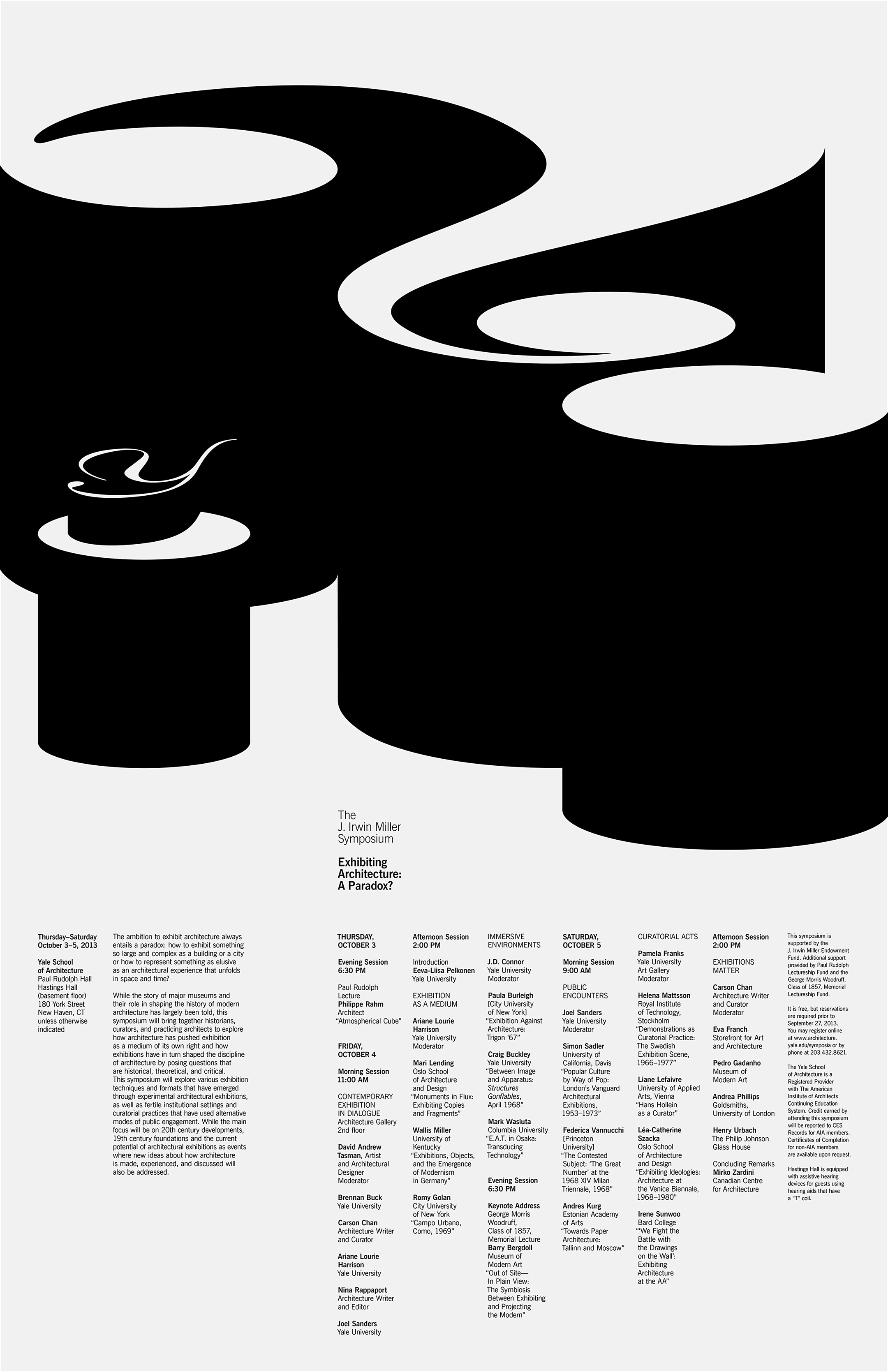
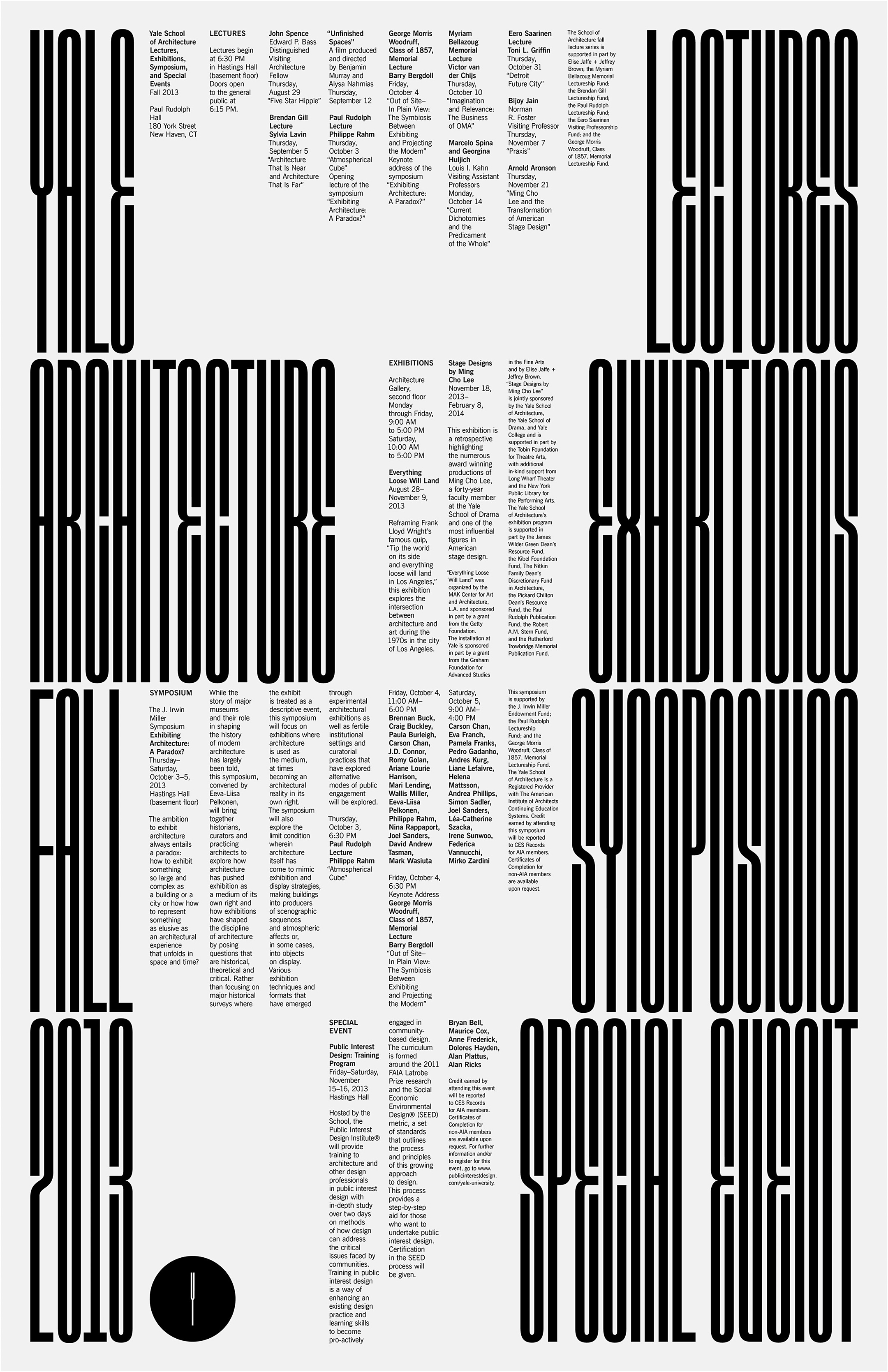
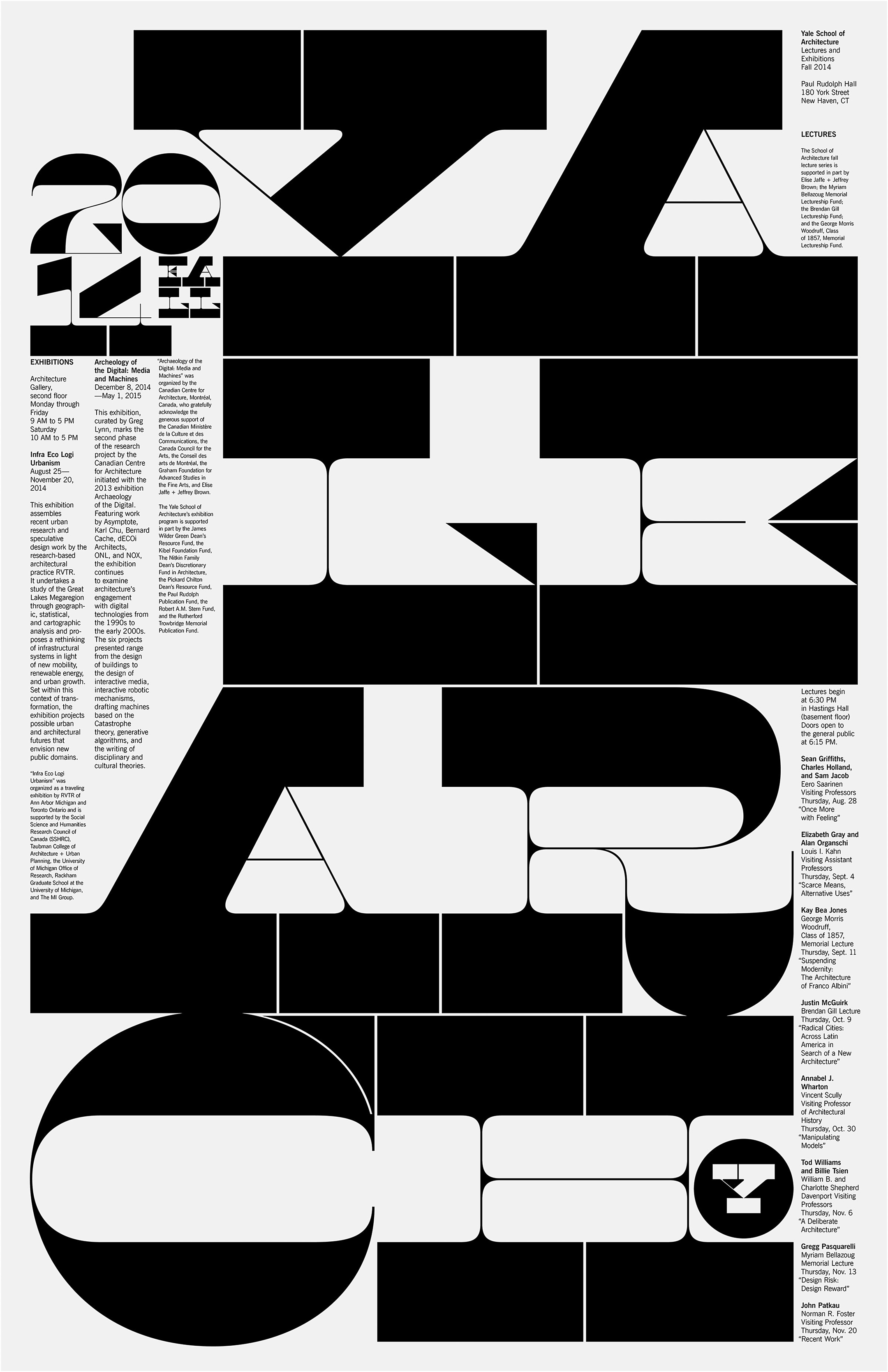
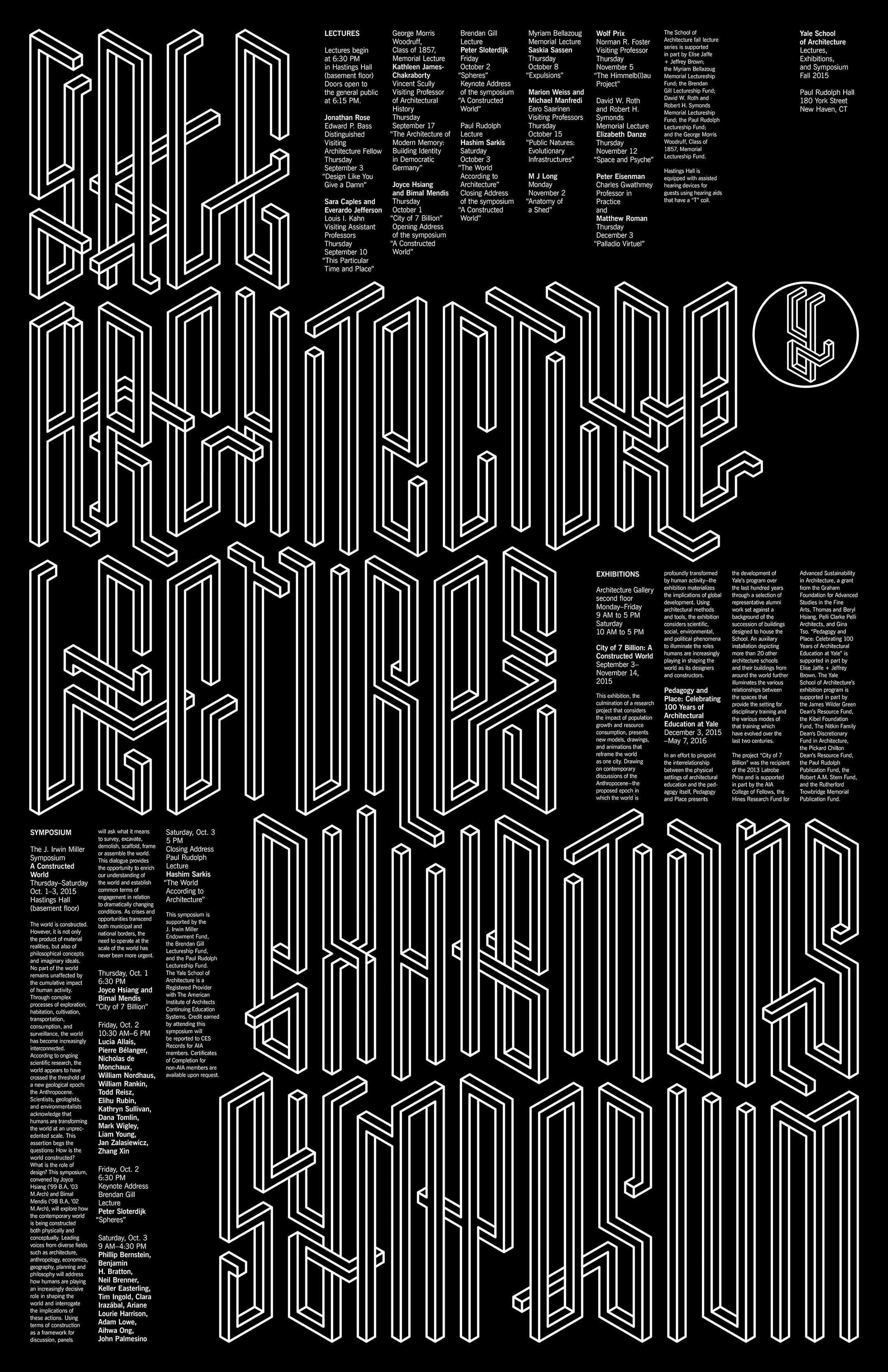
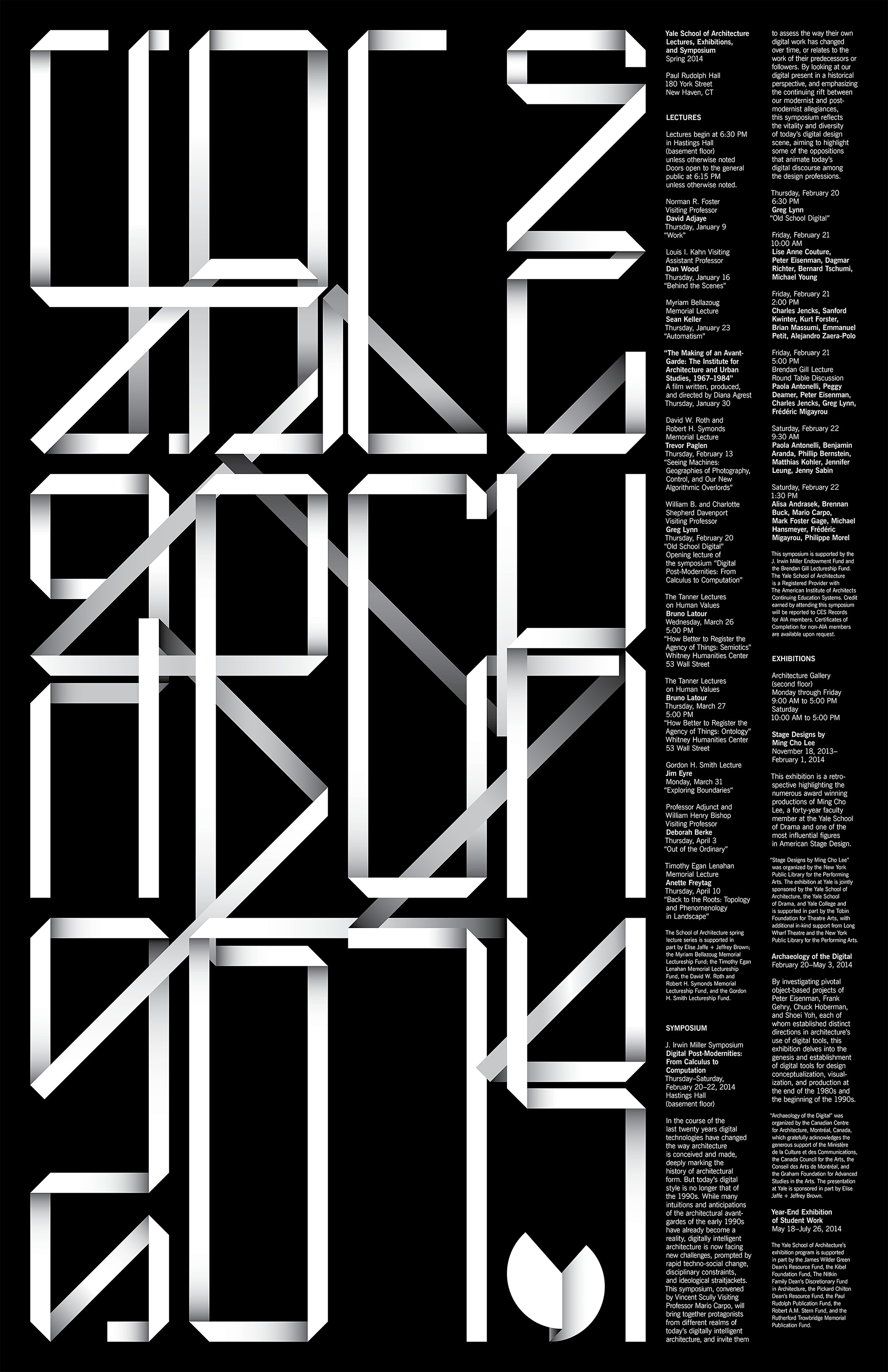
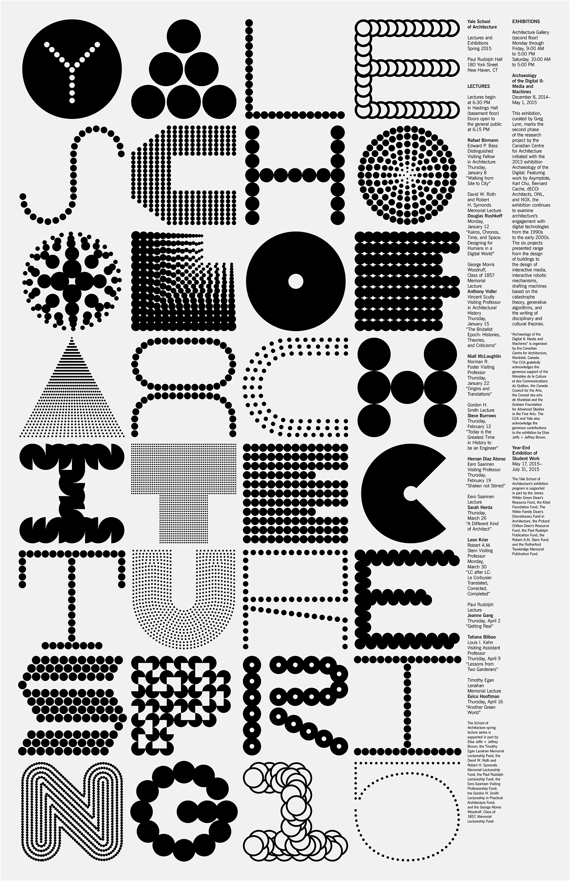
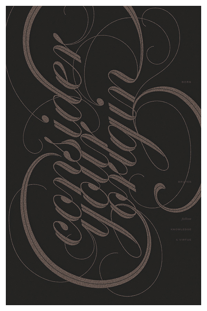
Her interest in typography & design started late in her academic career. Originally an English Literature Major (BA), she became inspired through a letterpress printing demonstration, along with constant exposure to & appreciation of classic books, book design & typesetting. After graduating she enrolled in the MFA program at the Yale School of Art. The work featured here represents work she had done for the Yale School of Architecture.

Discover more via the in-depth article / interview on Design Boom.

You can also follow her on Twitter & Pinterest.

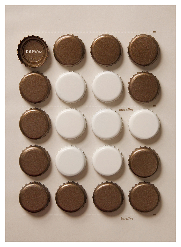
Images courtesy of Jessica Svendson.


Rizon Parein


After dropping out of high school at the age of 17, Belgium-born designer & illustrator Rizon Parein transformed his early talent & passion for graffiti into a career that places him at the forefront of typography & design. With his unique 3D style, Rizon has worked with Nike, Jay-Z, Toyota, Samsonite, & Nespresso, in addition to developing several movie posters. You can check him out on Facebook, Behance, Instagram, Twitter, and see more of his beautiful work at his own personal website

Images courtesy of Rizon Parein.


Dan Tobin Smith


From a previously published article on Typetoken:

Dan Tobin Smith’s ‘Alphabetical’ is an experimental project in more than one way: it is an exploration of typography using different materials but also one of perspective, where two-dimensional structures are recreated in three-dimensional settings. Dan plays with scale, colour, space, light and perspective, combining these elements to create the visual illusion of a flat letter when viewed from a certain angle.

Smith explains: “The project makes use of anamorphosis, or distorted projection to create the forms. This is a technique which dates back to the Renaissance and found one of its first uses in photography with an image called ‘The Human U.S. Shield’ made in 1913, which shows a staggering 30,000 officers and men of Camp Cluster forming an enormous U.S. Shield.”

The project started in 2005/6 when Creative Review commissioned the letter A for their Annual. I cannot even begin to fathom the ammount of work that goes into the assembly of even one such image. Truly astounding work. Dan is currently represented by the agency Art Partner. He can also be found on Instagram, and Twitter.

Images provided courtesy of Dan Tobin Smith.


Paul Tebbott


Some beautiful design & typographic work from Paul Tebbott, a visual artist, illustrator and designer from Manchester, UK. You can see more of Paul's amazing work at his website. Also find him on Flickr, Tumblr, Twitter, Society 6, and follow his musical entity, Horizon Fire over on Band Camp.

Images courtesy of Paul Tebbott.


Anthony James


Beautiful typographic studies from Anthony James. Based in Manchester, UK Anthony currently works as a freelance illustrator / graphic designer. You can see more of his wonderful work at Behance, or at his personal website.

Images courtesy of Anthony James.


Tom Davie


Some really nice typographic work here from Tom Davie. A little more on his background from his personal website:

Tom has worked as an artist, graphic designer and design educator. He received a Master of Fine Art in Visual Communication from the School of the Art Institute of Chicago (where he was awarded a full-tuition merit scholarship), and has taught graphic design at the university level for several years. Tom’s design work has appeared in Communication Arts, Print, IDN, Computer Arts & HOW magazine; he exhibits his fine art work regularly, and has been included in group shows from New York and Chicago, to the Palace of Culture in Sofia, Bulgaria. Tom regularly speaks and writes about graphic design, his thoughts on education, and approach to mixed-media work.

His work appears via his website Studio Twenty Six 2.

Founded in Chicago in 2003 as a multi-disciplined design and fine art studio. Studio Twenty Six 2 integrates painting, printmaking and graphic design to offer an eclectic mix of client-based design and research / concept-driven paintings and limited edition prints. The mission is simple: produce well crafted thought-provoking work in a variety of mediums.

You can also check out more of his work at Behance.

Images courtesy of Tom Davie.


Craig Ward


Craig Ward is a British born designer & art director currently based in Brooklyn, New York. A former ADC Young Gun (2008), recipient of the Type Directors Club Certificate of Typographic Excellence (2009) and TEDx speaker (Philadelphia, 2012), his work has been shown, awarded and documented globally in countless books, magazines and exhibitions. You can see more of his amazing typographical works on Behance & his personal website Words are Pictures.

Images courtesy of Craig Ward.


Áron Jancsó


Self proclaimed type addict, Áron Jancsó, creates beautiful typographic work from scratch, often designing every letter on a poster. A freelance designer, based in Hungary, Áron draws his inspiration from modernism, street culture & calligraphy. You can see more of his stunning work on Flicker, Behance & of course his own website.

Images courtesy of Áron Jancsó.


Mother New York - BikeNYC


I am loving the typography on this. BikeNYC, in partnership with Transportation Alternatives, launched a campaign calling attention to cyclists in the city. The ads also encourage people to visit BikeNYC.org which hopes to become an important destination for the city’s bikers, providing information on events and hundreds of options for social biking. Created by Mother New York.

Images provided by Mother New York.


Cristiana Couceiro


Beautiful collages from Lisbon based artist Cristiana Couceiro, whose work has appeared in the New York Times & New York Magazine. Cristiana got her start early as a child tearing up magazines & gluing together different shapes & colors. Later she would evolve her work to the computer. In a recent issue of Moloko, she talked about process & gathering source material. “On Saturdays I like to go through the flea market collecting memories. Feira da Ladra as we call it here in Lisbon. That means Thief Fair, which is funny collecting other people’s memory to build a new one”. Her source material comes from a variety of modern sources including: old Blue Note record covers, Canadian logos, 1960s paperback books, Latvian magazines, Swiss posters, as well as work from the Bauhaus. You can see more of her work at her website or her blog, www.hueandsaturation.tumblr.com.

Images courtesy of Cristiana Couceiro, www.cristianacouceiro.com.


Me! Me! Me!


Beautiful identity work from the design agency Me! Me! Me!, other wise known as The Attention Agency. They certainly got my attention.

Images courtesy of Me! Me! Me! www.mememe.dk.


Joey Camacho


Joey Camacho is a designer & DJ currently working out of Calgary, Canada. This beautiful typographic poster series called Daft Life caught my eye on the Wanken blog (Shelby White’s wonderful blog). I love the clean, dimensional type against the rougher, textured background. Simple messages, effectively delivered. We have a winner!

Images courtesy of Joey Camacho, www.joeycamacho.com


Marius Roosendaal


Marius Roosendaal is a multidisciplinary designer & art director based in the Netherlands. Extremely talented & visionary.

Images courtesy of Marius Roosendaal, www.mariusroosendaal.com.